The primary goal of the Climate Atlas is to allow Canadians from all walks of life to explore what climate change means for them, where they live.
Controlling the map should be familiar from other online tools such as Google Maps. You can grab and drag the map to move around, and you can zoom in and out using the +/- buttons (and various other mouse and touchscreen controls, depending on your device).
Climate Variables
Many kinds of climate data can be displayed on the map. The menu at the very bottom of the page presents categories of climate information:

You can find a wide range of options inside these categories, including seasonal and annual measures of average and extreme temperatures or amounts of precipitation that will be meaningful to almost everyone.
There are also more technical variables, such as heating and cooling degree days, that will be of interest to farmers, planners, and other professionals whose work is directly dependent on our changing climate.
The following table presents each of the climate variables within the atlas, a plain language description of the variable, as well as a short note explaining why each one is important. Regardless if you’re a homeowner, building manager, community planner, or landscape architect you’re sure to find variables in the atlas that are important to your life and livelihood. (You can find a much more detailed description of all these variables at https://climateatlas.ca/variables.)
Climate variable descriptions
| Variable | Description | Importance |
|---|---|---|
| Coldest Minimum Temperature | The very coldest temperature of the year. | Affects safety, recreation, buildings, transportation, energy use, etc. |
| Cooling Degree Days | Annual sum of the number of degrees Celsius that each day's mean temperature is above 18 °C. | Often used to estimate how much air-conditioning is required in a year. An increase implies hotter or longer summers. |
| Corn Heat Units | Temperature index used by farmers for when it's ideal to grow corn. | Used by farmers and agricultural researchers to make planting decisions and maximize production. |
| Date of First Fall Frost | The earliest date in the autumn when temperatures drop below freezing. | Marks the approximate end of the growing season and indicates the return of cold weather. |
| Date of Last Spring Frost | The latest date in the spring when temperatures drop below freezing. | Marks the approximate beginning of growing season and indicates the return of warm weather. |
| Freeze-Thaw Cycles | Total number of days per year when temperatures fluctuate between freezing and non-freezing. | Can have major structural impact on infrastructure such as roadways, sidewalks, etc. |
| Freezing Degree Days | Annual sum of the number of degrees Celsius that each day's mean temperature is below 0 °C. | High values are associated with relatively cold conditions, and indicate many days with temperatures significantly below freezing. |
| Frost Days | Total number of days per year when the coldest temperature of the day is less than 0 °C | These conditions indicate frost might form at ground level or on cold services. |
| Frost-Free Season | Interval between the first frost of the fall and the final frost of the spring. | Indicates when no freezing temperatures occur that might kill or damage plants or animals. |
| Growing Degree Days (5, 10, 15 °C) | Index of heat available for organisms (such as plants and insects) for growth. | Helpful for crop selection, insect control, and other management. |
| Heating Degree Days | Annual sum of the number of degrees Celsius a given day's mean temperature is below 18 °C. | Often used as a measure of how much heating is required in a year. |
| Heavy Precipitation Days (10mm / 20mm) | Total number of days per year when at least 10 mm or 20 mm of rain or frozen precipitation falls | Heavy rainfall can impact storm drains, flooding, erosion, roads, etc. |
| Icing Days | Total number of days per year when the warmest temperature of the day does not go above freezing (0 °C). | Indicator of the length and/or severity of the winter season, which affects human health and safety, recreation, heating costs, and more. |
| Maximum Temperature | The highest temperature of the day. | The temperature range we expect within a season or year is a very important aspect of climate. Changes in average and extreme temperatures can dramatically affect our everyday lives as well as a wide range of planning and policy decisions. |
| Mean Temperature | The average temperature of the day. | |
| Minimum Temperatures | The lowest temperature of the day. | |
| P-Days | Temperature index used by farmers for when it's ideal to grow potatoes. | Often used by farmers and agricultural researchers to maximize production. |
| Precipitation | Total annual amount of rain, drizzle, snow, sleet, etc. | Affects water availability, crop viability, hydroelectric power generation, fire risk, snow accumulation, flooding, and drought. |
| Summer Days | Total number of days per year when the temperature rises to at least 25 °C. | Increased health risks to vulnerable people, limits outdoor recreation, increased energy use, increased drought and fire risk, changes to ecosystems and biodiversity, etc. |
| Tropical Nights | Total number of days per year when the lowest temperature of the day does not go below 20 °C. | |
| Very Cold Days (-30 °C) | Total number of days per year when the temperature drops to -30 °C or below. | Indicator of winter severity that affects health, safety, recreation, ecosystems, etc. |
| Very Hot Days (+30 °C) | Total number of days per year when the temperature rises to at least 30 °C. | Increased health risks to vulnerable people, limits outdoor recreation, increased energy use, increased drought and fire risk, changes to ecosystems and biodiversity, etc. |
| Warmest Maximum Temperature | The highest temperature of the year. |
Climate Scenarios
You can choose between future scenarios that lead to more or less climate change, and display information for either the recent past or one of two future time periods.
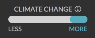
The climate of the future depends very much on the choices we make as a society: the atlas lets you easily explore the impacts of more or less global warming, resulting from different greenhouse gas emissions scenarios.
High Carbon Scenario (RCP8.5)
MORE CHANGE
Choosing more warming displays the “business as usual” scenario that assumes world greenhouse gas emissions continue to increase at current rates through the end of the century. Not surprisingly, these high emissions result in severe global warming. The Climate Atlas also refers to this as the High Carbon future, and it is based on what scientists call the RCP8.5 emissions scenario.
At present, based on the best available science, global emissions are on track to follow the High Carbon scenario.
Low Carbon Scenario (RCP4.5)
LESS CHANGE
Choosing less warming shows maps and data based on a scenario in which greenhouse gas emissions increase until about 2050 and then rapidly decline. This decline in emissions leads to less severe global warming than the High Carbon scenario. The atlas also refers to this as the Low Carbon future, and it is based on the RCP4.5 emissions scenario.
The Low Carbon scenario describes a world in which collective global action is taken to reduce greenhouse gas emissions.
Under both scenarios, the impacts of climate change are projected to become more extreme over time. The map displays information for three time periods, and moving back and forth between them allows you to compare the Recent Past (1976-2005), the Immediate Future (2021-2050) and the Near Future (2051-2080). As you change the various map options (type of data, severity of climate change, and time period), the title bar at the top keeps track of what you've chosen, so you always know what you're looking at. You can also always get more information about what the map is showing. Click on the information ( ) icons to get detailed explanations about the map you're exploring.
Watch Videos
No matter what climate information you select, you’ll see icons scattered around the map. They mark places with documentary videos you can watch to discover how people across Canada are learning about and taking action on climate change.
Local Data
Once the map has loaded up the chosen climate information, scenario, and time period, you can display data about places all across Canada.
Climate data is available for specific cities and towns, all the provinces and territories, and for square regions (called “grid squares”) all over the country. The grid squares are available from coast to coast to coast, so there is data available for all of Canada, even if your town isn’t on the map, or if you want to learn about a remote or rural area.
Click on a place, such as one of the grid squares or a city or town, to get more detailed climate change information about that specific place.
Map Sidebar
When you click on a map location, a sidebar appears, displaying climate information for that place.
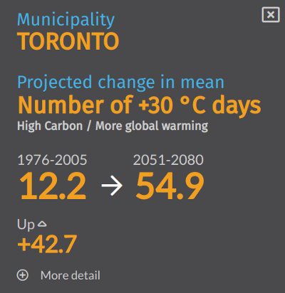
The summary at the top of the sidebar tells you what place, variable, and scenario is being displayed, and provides an overview of the projected change. The summary numbers are averaged over large spans of time (30-year periods) and across 12 different climate models, allowing you to quickly and easily get a sense of the overall change projected by the climate models.
Clicking on the “More Detail” button below this summary reveals the range of the 12 model projections, averaged over the 30-year time periods. Examining the low and high values provides some information about the overall variability in the model projections.
Similarly, the graph displayed a little lower down in the sidebar illustrates how the range and mean (average) of the model projections varies within these time periods.
Below the graph are sets of links that provide access to still more data, and to pages of information about how the climate data was created and how it should be used and interpreted.
The Explore detailed climate data link leads to the Local Data Page, where all the climate variables can be graphed in various formats. You can even export the values for your own use. The Download climate report link will provide you with a PDF report that presents some representative climate change data for the chosen place, for both the High Carbon and Low Carbon scenarios, in a handy one-page format.
(See section 5, “Interpreting Climate Data” in this guidebook for more detailed information about interpreting these values.)
Map Settings
You can customize the map display. To access the settings menu, activate the gear icon () just below the zoom buttons in the top left corner of the map. You can select metric or imperial units of measurement, whether or not to display various helpful visual elements, and whether you would like to see regional information for provinces/territories or the smaller grid boxes.
Language Selection
The entire content of the atlas is available in English and French. To switch the language, click on the En or Fr icons in the upper-right corner of any page.
Sharing the Map
You can share the map display on social media or by email. The map will get shared exactly as it looks. If you are zoomed in on a specific location, or if you have a sidebar open showing details about a town or region, that display is what others will see when you share.
Recommended Article Citation
Climate Atlas of Canada. (n.d.) Using the Map. Prairie Climate Centre. https://climateatlas.ca/atlas-guidebook/using-the-map


.png)