Many users want more detailed information than the summary provided by the map sidebar. Graphs, tables, and additional statistical and scientific data for users with more detailed needs or interests can be found for all locations using the Local Data Page.
This page is also useful for people who use screen readers or keyboard navigation and find the map difficult to use. The Local Data Page provides access to all the data found on the map, but in more accessible forms and tables. Following the Find local data link in the main menu (and choosing a location) or following the Explore detailed climate data link in the map sidebar will take you to the Local Data Page. This page displays climate data in the form of graphs and tables.
There are four types of graphs: time series plots, frequency plots, scatterplots and climographs. The type of data/graph is controlled by the dropdown menu, as are various options such as emissions scenario and season, if relevant. The time series and frequency data can be displayed for all the climate variables available through the map, in both High and Low Carbon scenarios. Mean, maximum, and minimum temperature and mean precipitation can additionally be displayed annually or seasonally.
Time Series
The time series graph displays observed historical values for the chosen variable for 1950-2005 and the climate model ensemble mean and range for 1950-2095. This lets you display modelled and historical values at the same time. You can also see the range and mean of the ensemble of 12 models year by year, all the way through to the end of the century.
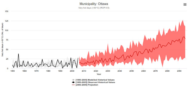
Projected change in the number of +30 °C days under the high carbon scenario (RCP8.5) for Ottawa. The black line represents historical observations, while the shaded areas illustrate the range of climate model projections (1950-2100).
Frequency
The frequency graph displays the frequency distribution of modelled values for three different time periods (1976-2005, 2021-2050, and 2051-2080) for the emissions scenario being displayed. This allows you to see how overall variability as well as average values change under different conditions and in different time periods.
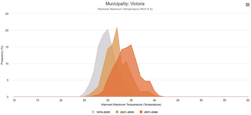
Projected change in the average warmest maximum temperature under the high carbon scenario (RCP8.5) for Victoria. The grey area shows the distribution of temperatures for the baseline period (1976-2005), while the yellow and orange areas represent the distribution of temperatures for the 2021-2050 and 2051-2080 future periods.
Scatterplot
The scatterplot graph displays the change (relative to 1976-2005) in average annual temperature (in °C) and average annual precipitation (in %) for each of the twelve climate models in the ensemble, for the chosen emissions scenario. This provides a way to visualize the amount of agreement within the ensemble of models for this location. Note that the scatterplots are only produced for annual temperature and precipitation values.
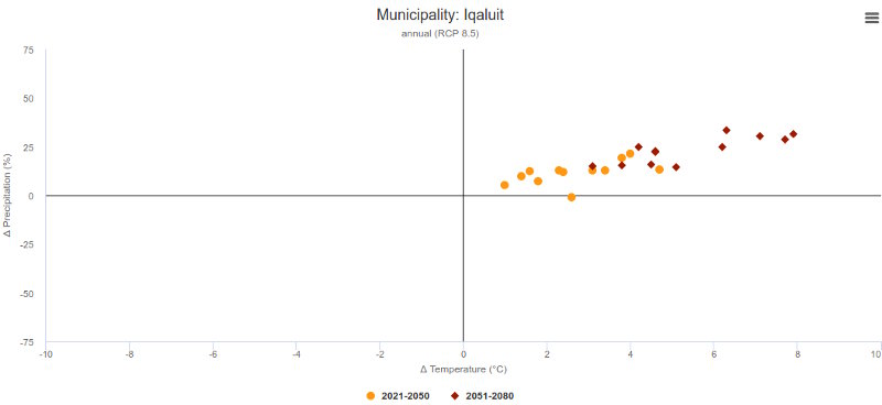
Projected changes in mean annual temperature and total annual precipitation made by twelve climate models under the high carbon scenario (RCP8.5) for Iqaluit. Yellow dots represent the time period 2021-2050 and red dots represent the time period 2051-2080.
Climograph
The climograph displays modelled monthly average temperature and total precipitation for two time periods: the 1976-2005 baseline and either the 2021-2050 or 2051-2080 future period.
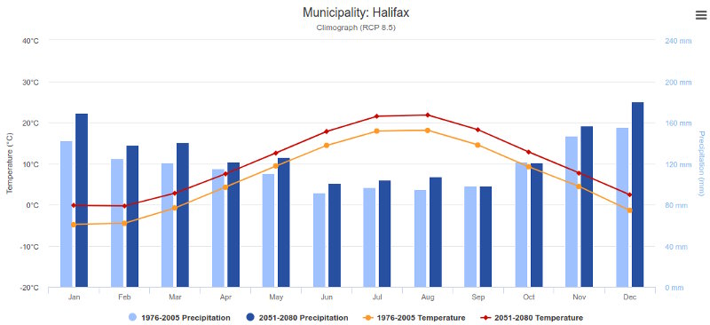
Projected monthly mean temperature and total precipitation projections under the high carbon scenario (RCP8.5) for the 1976-2005 (baseline) and 2051-2080 time periods, for the city of Halifax. Vertical Bars represent precipitation and lines represent temperature.
Exporting Data and Graphs
The data used to create the graphs is displayed in a simple table beneath the graph, and the data can also be downloaded in comma-separated values (CSV) format, which is easily opened by any spreadsheet or statistics program. In addition, the graphs themselves can be exported in a variety of image formats using the menu icon () in the top right corner of the graph.
Recommended Article Citation
Climate Atlas of Canada. (n.d.) Local Data. Prairie Climate Centre. https://climateatlas.ca/atlas-guidebook/local-data


.png)