
In the past, trying to answer questions such as “how might summer temperatures in my town change in coming decades?” required a lot of technical skill and effort: climate data had to be found, selected, and downloaded; time periods and emissions scenarios had to be chosen; the data had to be computed, analyzed, mapped, graphed, and interpreted. The Climate Atlas has done all that work for you, freeing you up for the important business of exploring, learning, and responding.
But interpreting climate model data can be complex, especially if you need to develop adaptation policies or do detailed planning. This section of the guide explains how to understand the data presented in the atlas so you can confidently work with it to answer your questions and best understand the future climate and its potential consequences.
Historical and Modelled Data
Most of the values presented in the Climate Atlas are from climate models. In particular, the 1976-2005 (Recent Past) values used throughout the Atlas as the baseline are from climate model simulations for this period. In the maps and on the Local Data Page, the atlas puts simulated means and ranges side-by-side with observed historical data for easy comparison. For the most part, you will see that the historical values fall within the range of the simulated data, especially for temperature.
For the period 2006-2095 the atlas uses climate model data to show how the climate is projected to change, using two emissions scenarios. For more about climate models and modelling, see the “Climate Change Projections” article on the Atlas.
Mean Values
Many of the numbers presented in the Climate Atlas are averages. The map sidebar and various reports, for instance, prominently display the mean value for 12 climate models over one of three 30-year time periods (1976-2005, 2021-2050, 2051-2080). Looking at mean values provides a simple sense of the direction and general magnitude of change.
The use of 30-year periods is a scientific convention based on the statistical guideline that a minimum of 30 points of data are required to reliably determine a mean. Thus, averaging data over 30 years is used to represent the average state of a climate. Taking the average for a 30-year period helps ensure that what is being described is an aspect of the climate system and not the more variable experience of weather.
Yearly averages can change a lot from year to year, whereas a 30-year average removes a lot of that variation, and reveals common conditions across the time period more so than differences between years. This means that when 30-year averages differ, that difference is probably noteworthy because it represents a multi-year trajectory of change that’s unlikely to be caused by short-term (seasonal, yearly, or even decadal) variability.
Averaging across an ensemble of 12 climate models is an important strategy that means we are not relying on results from just one or two climate models. Models take a variety of approaches and make different assumptions about how best to represent the amazing complexity of the global climate system; as such, they of course provide different projections of future climate conditions and different simulations of past climates. Taking the mean of an ensemble of 12 models—like taking the mean over a period of 30 years—emphasizes their common agreement about the direction and magnitude of change.
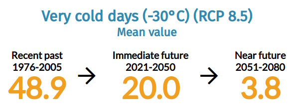
Below is an example of projected change in the number of very cold days (under RCP8.5, the High Carbon emissions scenario leading to more severe climate change) for the region surrounding Iqaluit in Nunavut. These numbers tell a story of dramatic change, with the region losing 90% of its mean number of very cold winter days.
Range and Distribution
The mean values presented in the Climate Atlas provide a very important summary of the climate data, but also a very partial one. Means are simple measures of the “central tendency” or average midpoint of the values, but don’t convey how much the values vary from one another. Thus, another key aspect of the climate model data presented in the atlas is the variation among the 12 models, and across each 30-year period.
This aspect of climate model data is present in the atlas in the form of model agreement (how much the projections from the 12 models in the ensemble vary) and yearly variability (how much the 30 individual years in a time period vary).
Model agreement
The 12 climate models used to generate the data presented in the atlas vary in their simulations of past climate and projections of future climate. The range of values produced by the models is presented in a couple of places in the Atlas.
High and low model values
The highest and lowest values in the ensemble of 12 models can be revealed in the map sidebar using the “More Detail” option that can be found below the mean value and above the graph.
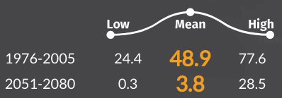
The above illustration shows the model range for some of the same data described above (very cold days for the region surrounding Iqaluit in Nunavut, under RCP 8.5, the “High Carbon” emissions scenario), comparing the Recent Past (1976-2005) with the Near Future (2051-2080).
The Low and High ends of the range show the full range of model results for this time period and carbon scenario. In this case, it shows that the very highest projected number of cold days in the future is very close to the lowest end of the simulated historical values, confirming that a drastic overall change is projected across the range of models. The data also confirms that there is quite a bit of spread between the lowest and highest modelled values for each time period.
Scatterplot
Knowing the very top and bottom values of the range is helpful, but doesn’t fully capture the degree of agreement between the models. In order to provide a better visual sense of model variability, the atlas provides scatterplots of the basic model output (annual temperature and precipitation).
This visualization can be found on the Local Data Page for any location in the atlas. This graph displays the projected change (or ‘delta’, Δ) in annual mean temperature and annual mean precipitation for the time periods 2021-2050 and 2051-2080, relative to the simulated values for 1976-2005.
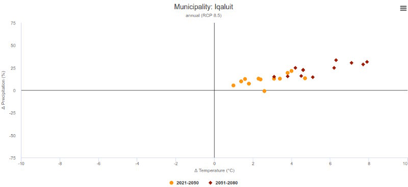
This scatterplot shows a high level of model agreement. All the models indicate that the climate is projected to get warmer and wetter.
Yearly variability
Thirty-year mean ensemble values are very helpful summaries, but of course they collapse thirty different yearly values into a single number. The differences between years are also important, and the distribution of those yearly values around the mean can look very different, given various climate scenarios and time periods.
There are at least two graphs in the atlas that convey the yearly variation that is helpful to consider in addition to the overall 30-year mean.
Line graphs
These graphs display the full spread of the modelled values, year by year, and also display the observed historical record for easy comparison. A small version of this graph is found in the map sidebar, and a larger, downloadable version is available at the Local Data Page.
The following image is a sample of the annual graphs available at the Local Data Page, showing the number of very cold days in the Iqaluit region. For the period 1950-2005 you can see a black line; this is the historical data, based on meteorological observations. Behind that line is a grey line and a shaded grey area. The line is the 12-model average of the data simulated for this location and time period; the shaded area marks the range of the simulations. For the period 2006-2095, the red line is the average of the 12 model projections for the chosen emissions scenario, and the shaded area defines the range among the models.
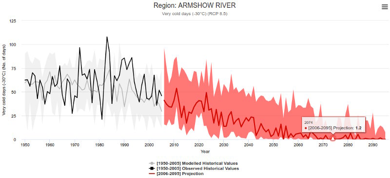
Thus, in one graph you can see how well the models were able to simulate past conditions, and the trajectory, magnitude, and range of the changes projected for the coming decades. Switching between the Low and High Carbon scenarios also shows you how different the climate is expected to be under the two scenarios.
Frequency plots
One very effective way to examine and compare the conditions expected in the various time periods is through the use of frequency distribution curves. This graph is available on the Local Data Page, and presents the distribution of yearly ensemble values in each of the 30-year periods.
These frequency curves show how often various values are projected to occur over each 30-year period. The impact of our changing climate can show up quite dramatically in the increased likelihood of what were previously rare and extreme conditions.
They reveal what kinds of extremes might occur, and how often. Some very warm years, for example, might have many times more the number of hot days than the long-term average. The range of modelled values across a 30-year period highlights how variable our climate system is. In many cases, these ranges become larger the further you look into the future, an indication of increased climatic variability.
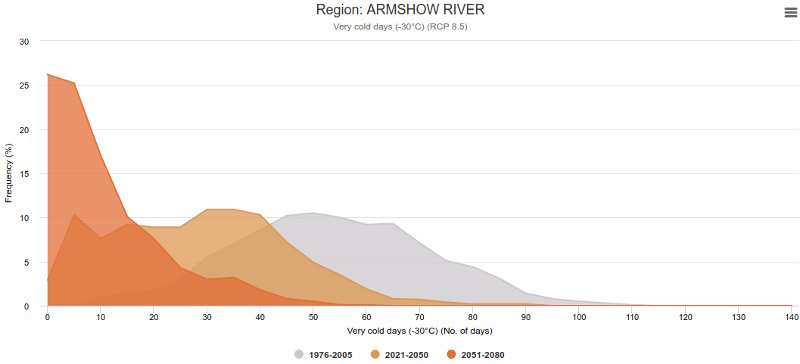
For the Iqaluit region, the graph above shows that years with low numbers of very cold days were relatively rare in the Recent Past, but are projected to become much more common in the coming decades under the High Carbon scenario. The historically typical number of very cold days is set to become an unusually cold season, even in the 2021-2050 period, and vanishingly rare thereafter. Toggling between the Low and High Carbon scenarios shows how different the changes will be under the two scenarios.
Uncertainty
As the foregoing discussion of ranges and variability demonstrates, interpreting and understanding climate data inevitably means working with uncertainty. Climate scientists identify three main sources of uncertainty in the modelling of future climates.
Natural Climate Variability
The climate system has many components, some more important than others, and which operate over different time scales. This results in year-to-year and decade-by-decade variations in weather patterns.
Climate Model Uncertainty
Techniques are constantly improving and computers are getting more powerful, but climate models will always be partial simulations of the real world. Furthermore, each climate model produces somewhat different results, depending on how the modellers have chosen to represent different aspects of the climate system.
Future Emissions Uncertainty
Earth’s future climate is highly dependent on worldwide greenhouse gas emissions. Possible changes in the intensity of emissions depend on global demographic shifts and political decisions that are very complex to predict and model.
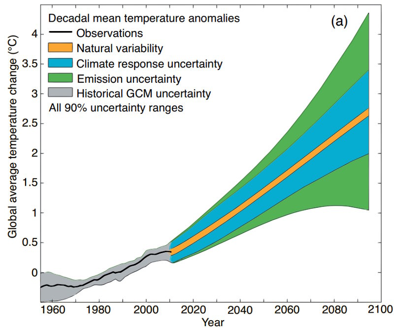
The diagram below shows that the uncertainty related to emissions is much larger than that from model uncertainty (here called “climate response uncertainty”) and natural variability. In fact, the narrow band showing “Historical GCM uncertainty” shows that models do a very good job of simulating the climate of the past, which means we should pay careful attention to what they say about the climate of the future.
There is a much fuller discussion of uncertainty in the Climate Atlas at climateatlas.ca/uncertainty if you want to know more.
Working with uncertainty
Understanding these various kinds of uncertainty is helpful when it comes to interpreting climate data. Representative Concentration Pathways (RCPs) have been developed to address the problem of uncertain future emissions by defining a variety of possible scenarios that lead to greater or lesser greenhouse gas concentrations in the atmosphere. This means, however, that one must decide which emissions trajectories to include in one’s climate studies.
The Atlas offers two scenarios, RCP8.5 (“High Carbon”) and RCP4.5 (“Low Carbon”), that result in more warming or less warming, respectively. Other IPCC climate scenarios exist, specifically RCP6.0 and RCP2.6, but they have been excluded from the atlas to simplify the interface and to be consistent with national and international impact assessments that focus on RCP8.5 and RCP4.5.
The Climate Atlas includes observed historical data to illustrate how well the climate models simulate the natural variability of past climates. For the most part, these historical values fall within the range of the simulated data, especially for temperature (precipitation tends to be more variable). And the atlas uses ensemble mean values to avoid the risk of relying on any one model and to mitigate the challenge of model uncertainty.
In the simplest sense, “uncertainty” means we don’t have 100% of the information about a situation or system. As we almost never have absolutely all the information about anything, we constantly have to make decisions in the face of uncertainty. Our changing climate is no different.
Importantly, uncertainty doesn’t prevent us from drawing confident conclusions about overall future patterns. Climate models are remarkably consistent in their overall results, and all of them tell essentially the same story: severe climate changes are likely to happen if we do not reduce greenhouse gas emissions soon.
Recommended Article Citation
Climate Atlas of Canada. (n.d.) Interpreting Climate Data. Prairie Climate Centre. https://climateatlas.ca/atlas-guidebook/interpreting-climate-data


.png)